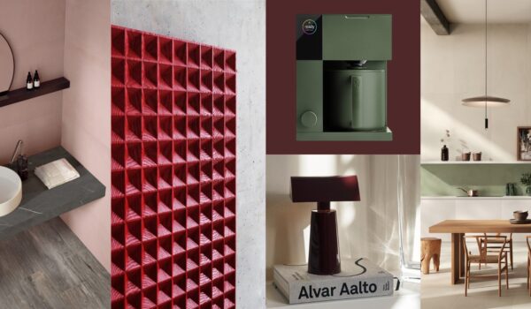
Color Stories
Dare we say it, but color is for the brave. If we compared it to music, it is the sharp staccatos that add a certain pop and accent to the piece. As designers, we tell stories through space or allow the spaces we design to be the perfect backdrop for users. Sometimes we create the space so that it tells a story – one that transcends trends and time.
Every year, companies such as Pantone, Sherwin Williams, and Benjamin Moore select and publish their predicted color trend along with the highly anticipated “color of the year.” A long and arduous process we imagine! Often with these colors come a narrative and even a tale providing a name that eludes to emotions or feelings. Keep reading for our take on these color stories and how you might want to incorporate them into your life to elicit a certain je ne sais quoi!
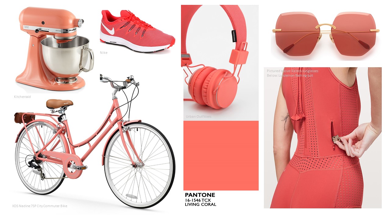
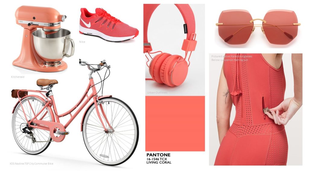
Living Coral – Pantone
In the design world, the Pantone Colour of the Year is a big deal – it is the forecast for many things to come. This year’s color is cheerful and breathes life – the peachy hue adeptly dubbed “Living Coral.” While most people will usually avoid the orange spectrum, Living Coral has a gentle energy that is not overly intrusive. We’re finding that it makes a great statement, but not one that you will regret in a matter of months. If you want to start off small and personal, a little nail polish is an easy first step. Pantone partnered with Butter London to create a set of 3 nail lacquers in Living Coral. If you are someone who likes to express themselves with their phone case, this inexpensive one from Amazon won’t break the bank! These coral sunglasses by Kaleos have a great shape in addition to adding a pop of color. Why not wear them riding your stylish XDS Nadine 7sp Hybrid City Commuter Bike in Pink Coral. Heading to the beach? Lululemon has a great Beach Break Paddlesuit perfect for a day of snorkeling or paddleboarding in a refreshing poppy Coral. Urban Outfitters has headphones inspired by the Pantone color of the year, although sadly now sold out. Nike’s Women’s Quest running shoe in coral round out our athletic inspirations. Looking for that statement piece? Why not add the Kitchenaid mixer in one of their latest colors Bird of Paradise, sure to stand proud on your counter.
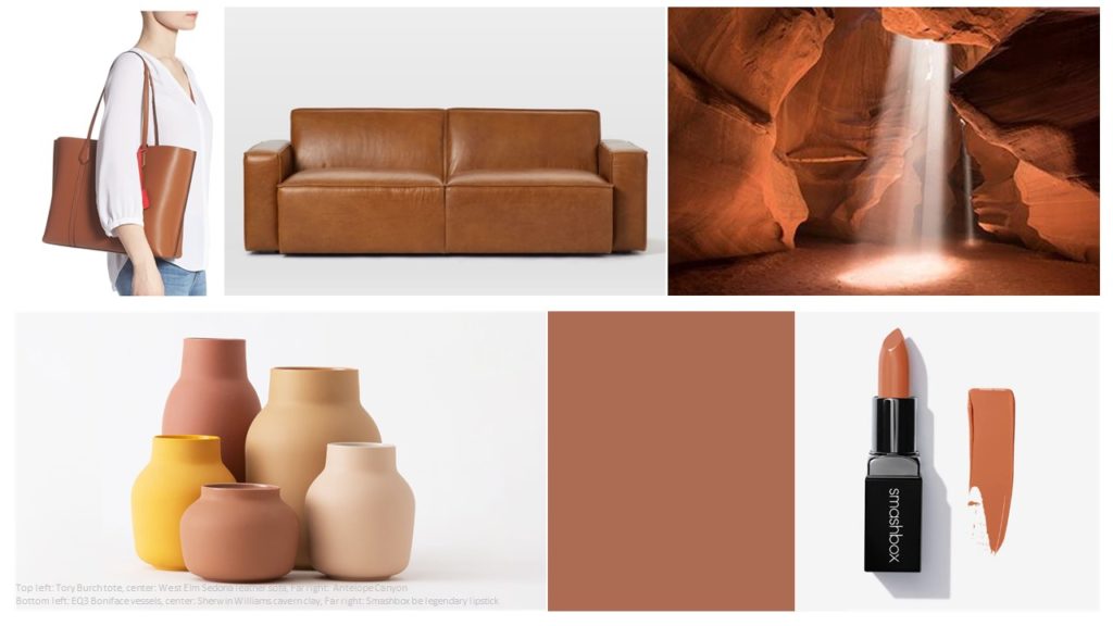
Cavern Clay – Sherwin Williams
Elemental and down to earth describes Sherwin William’s Color of the Year – Cavern Clay SW 7701. Reminiscent of sturdy ancient monuments, this color brings an artisanal, yet refined quality. It reminds us of places like Machu Pichu and Antelope Canyon. Sherwin Williams suggests that you pair it with wood furniture, furnishings with patina and greenery – and we couldn’t agree more! Bringing in natural textiles and fibers such some linen brings some softness to it as well. We think it would be a great color to use on a piece of furniture that needs an update such as a buffet without going too over the top! You could add a collection of the Boniface vessels from EQ3. For a more substantial piece might we recommend this seriously comfy Sedona Leather Sofa from West Elm? For the fashionista how about trying the Smashbox Be Legendary Lipstick in color Chai or the beautiful Perry Leather Laptop Tote by Tory Burch available at Nordstrom.
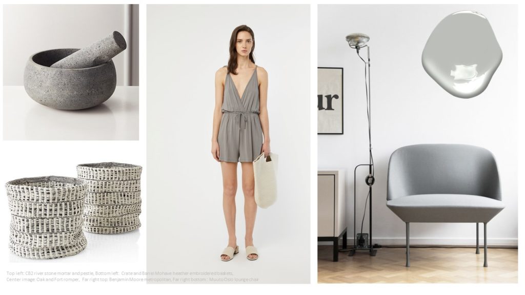
Metropolitan – Benjamin Moore
Much less bold than Pantone and Sherwin Williams is Benjamin Moore’s Colour of the Year 2019, Metropolitan AF-690. We would consider this color as a perfect neutral – a soft backdrop to pretty much anything. Metropolitan is a light grey – one that is neither too warm or too cold. It reminds us of the stone masonry buildings you find in Europe – the ones that only become more beautiful with age. With this color, we wouldn’t hesitate to take it the whole mile and use it on all four walls of a room. For a stylish and classic look, pair it with black or white accents. For a more bold approach, you could add a pop of color. Not ready to paint the walls yet? Try incorporating these small kitchen accessories River Stone Mortar and Pestle or Matte Grey Spice Grinder from CB2. Over at Crate and Barrel, you will find outdoor pillows or these slouchy woven Mohave Heather Embroidered Baskets which can double as planters. Oak and Fort offer a beach-worthy Romper in grey. If you follow our blog on a regular basis you will already know we are big fans of the Muuto furniture line. They have multiple options in grey from accessories, soft seating like the Oslo lounge chair to their Ambit wall lamp to name only a few items. So many its hard to choose just one.
Which Color of the Year do you like most? Let us know with the hashtag #area3designcolor2019